


 Add to Reddit

The User Interface
Application Icons
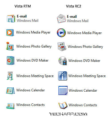
The first change we noticed involved the application icons. Most of the icons underwent a major makeover. However, we have mixed feelings about the new icons.
We feel that the pre-RTM icons are much better-looking. We wonder if Microsoft merely changed them to give a perception that Vista RTM is truly a lot more polished than previous Vista releases.
It's very clear that Microsoft is trying to incorporate the Vista color scheme with a touch of orange in the new icons. However, they turned out quite badly, looking somewhat cartoon-like.
The Windows Media Player icon is, by far, the worst-looking icon. It looks like it was done in a hurry, and the orange play logo looks out of place.
The Windows DVD Maker's icon takes second place. Without looking at the description, we wouldn't even have the slightest idea what that icon is supposed to represent.
We are truly disappointed with the new icons. We think Microsoft should not try to fix what's not broken. Now, they are truly broken. Let's hope there's a fix for these mangled icons soon enough.
Anti-Aliased 3D Flip
In Windows Vista Beta 2, users were complaining that the 3D Flip feature looked terrible without anti-aliasing. From RC2 onwards, and of course in Vista RTM as well, 3D Flip is now anti-aliased. Needless to say, it looks much better now, although we still doubt its usefulness.
) |
I mean, sure it works but it really isn't a tool that is likely to help improve your productivity. It is merely a visual novelty. In the Macs, you get to see all the application face-forward, which is a much better feature, IMHO.
) |
Nevertheless, this feature gives users an alternative to the traditional icon-based Alt-Tab switching of applications. Regardless of which version you choose, you will still be able to enjoy the Vista Aero interface.
Maximized Window Vista Aero
In the early days of Vista, a maximized application would have a flat colour at the top window. It makes the window look less attractive. Many users have been requesting Microsoft to give the maximized window a semi-transparent effect as well. Microsoft compromised a little.
) |
Now, instead of a flat colour, the maximized window will have a glass-like effect and its colour will be a blend of black and the colour of the desktop. We can't really say if we prefer this over the flat colour. It does look a little awkward with certain wallpapers as the colour can appear quite pale.
<<< Microsoft Windows Vista RTM, So, What's New in Vista?, Installation : Previous Page | Next Page : The User Interface (Cont.) - Windows Aero Pointers, Desktop Wallpapers, The Control Panel >>>