


 Add to Reddit

ED#53 : Bad Charts Make Good PR
Charts are used in many press releases and reviews to easily convey complex performance data to the reader. Everything you need to know can be summarized using a bunch of bars in a chart. However, charts are often misused to inaccurately present skewed perceptions of the actual data.
Take for example, the performance data from AMD in the AMD Quad-Core Opteron (Barcelona) Technology Report Part 2. The data was presented in the form of easy-to-understand charts. That's great for everyone, particularly investors who may not understand the technical information and data. However, those who look closely will see that the charts have been skewed to present a far more optimistic view of the processor than the data really suggests.
We are not specifically focusing on AMD. They are merely the latest of many companies to mess with their charts to make them "look better". Many other companies do that as well. It's understandable why. These enhanced charts are designed the portray their products as far superior that competing products, even if the data does not reflect that.
It may not fool the astute reader but if they can fool even 1% of those who read, it's well worth the effort. For a little work in Excel, they would have won over that 1% of buyers or investors who took the charts at full face value. Of course, the actual success rate is very much higher than that. Most readers do not even bother to examine the charts in detail. So, whenever possible, we try to redo the charts to make them accurately reflect the data.
However, time constraints often force writers to rely on performance charts provided in press releases. Sometimes, it's all they are provided. For example, the AMD documents only displayed those charts. The actual data were not given. So, even if we posted the charts here at Tech ARP, always check to see if they tell the truth.
What's Seen, What's Real?
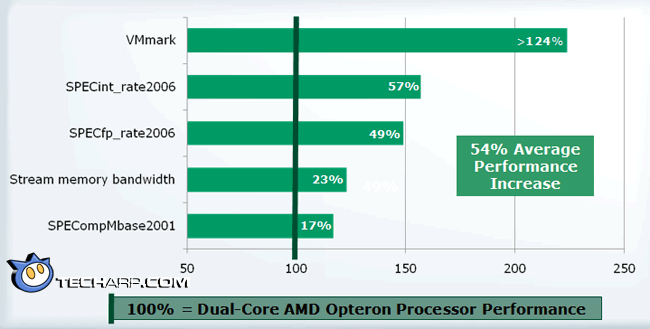
The most common (and easiest) way to skew data is to make the Y-axis start at a higher number. This has the effect of making any difference appear much larger than it really is. Let's take a look at the AMD charts for example.
Performance Advantage Of Quad-Core Vs. Dual Core
These charts examine the performance advantage of the new AMD Quad-Core Opteron over its dual-core predecessor. The original chart makes it appear as it the Quad-Core Opteron is 2.5X faster in VMmark and over twice as fast in SPECint_rate2006 and almost twice as fast in SPECfp_rate2006.
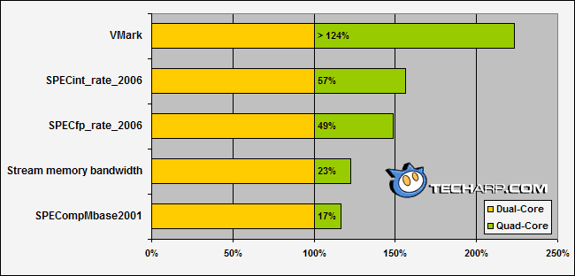
But when we corrected the chart, the differences looked much less significant. Here, you can see that the Quad-Core Opteron's performance advantage in both SPECint_rate2006 and SPECfp_rate2006 really looked like they were about 50% more. Compare that to the chart above.
Let's take a look at more charts from the AMD Quad-Core Opteron (Barcelona) Technology Report Part 2.